

Design, gastronomy, and technology in a new 0.0 category beyond sake.
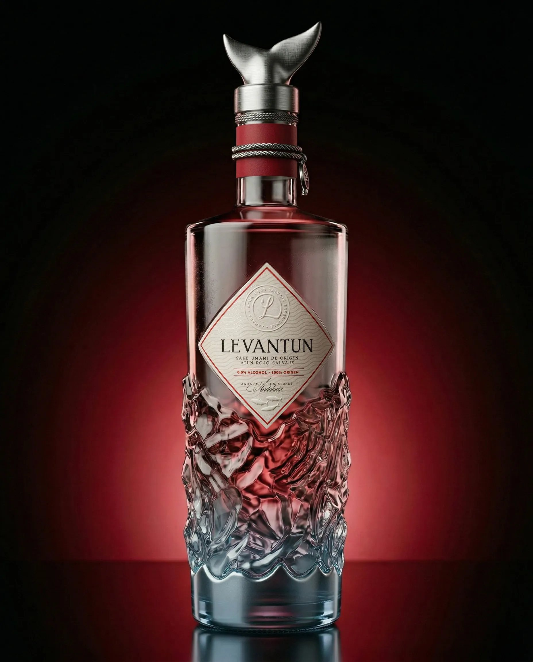
More than a product, LEVANTUN® is conceived as a designed object applied to gastronomy. An umami extract created for bluefin tuna that introduces a new logic: not to accompany, but to intervene with precision — positioning itself conceptually beyond “sake”.
The project is structured through design as a system.
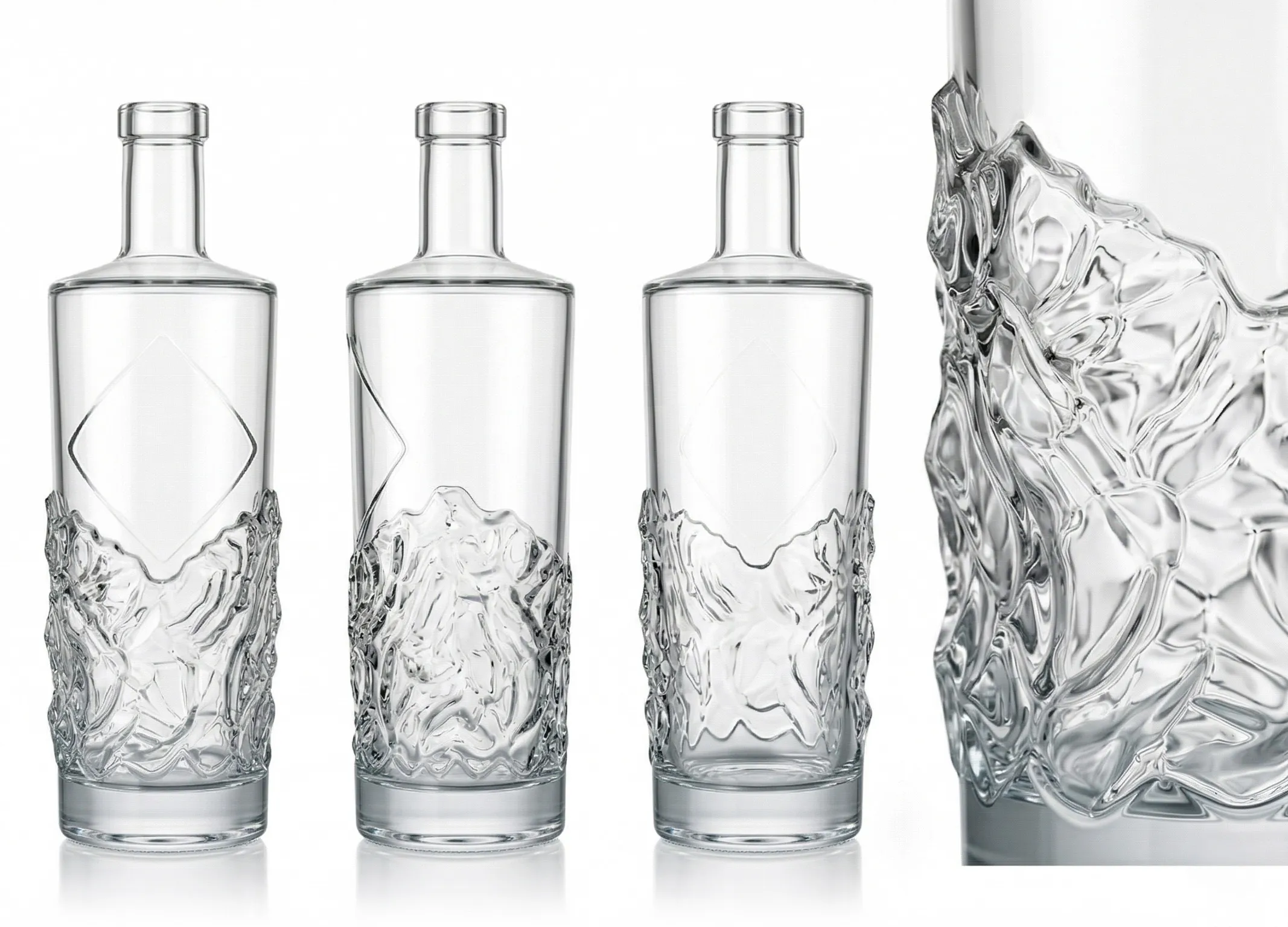
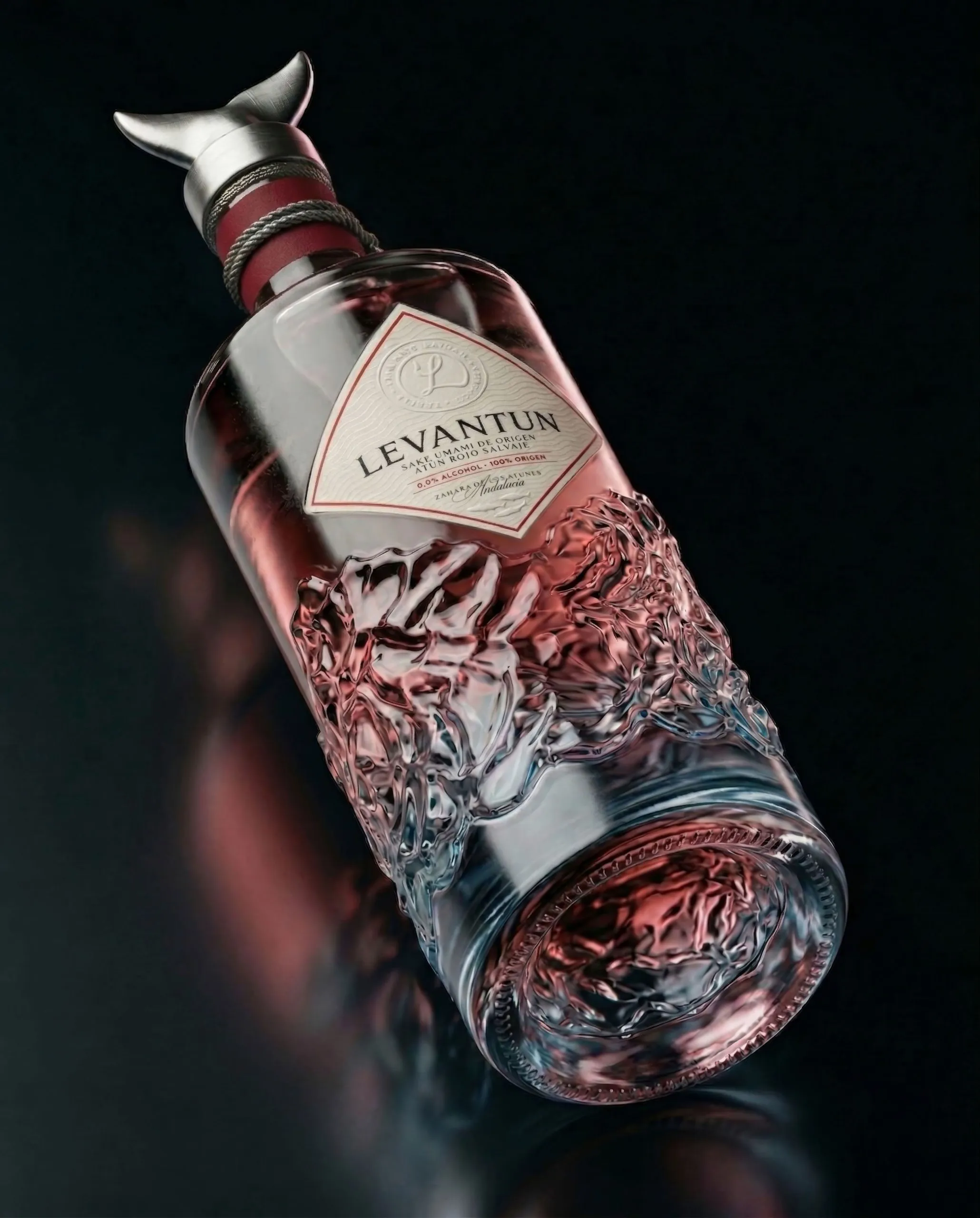
The bottle interprets the levantá of the almadraba: a fluid, organic base, where the glass expresses the tension of water in motion; and a restrained, almost surgical upper section, acting as a control plane.
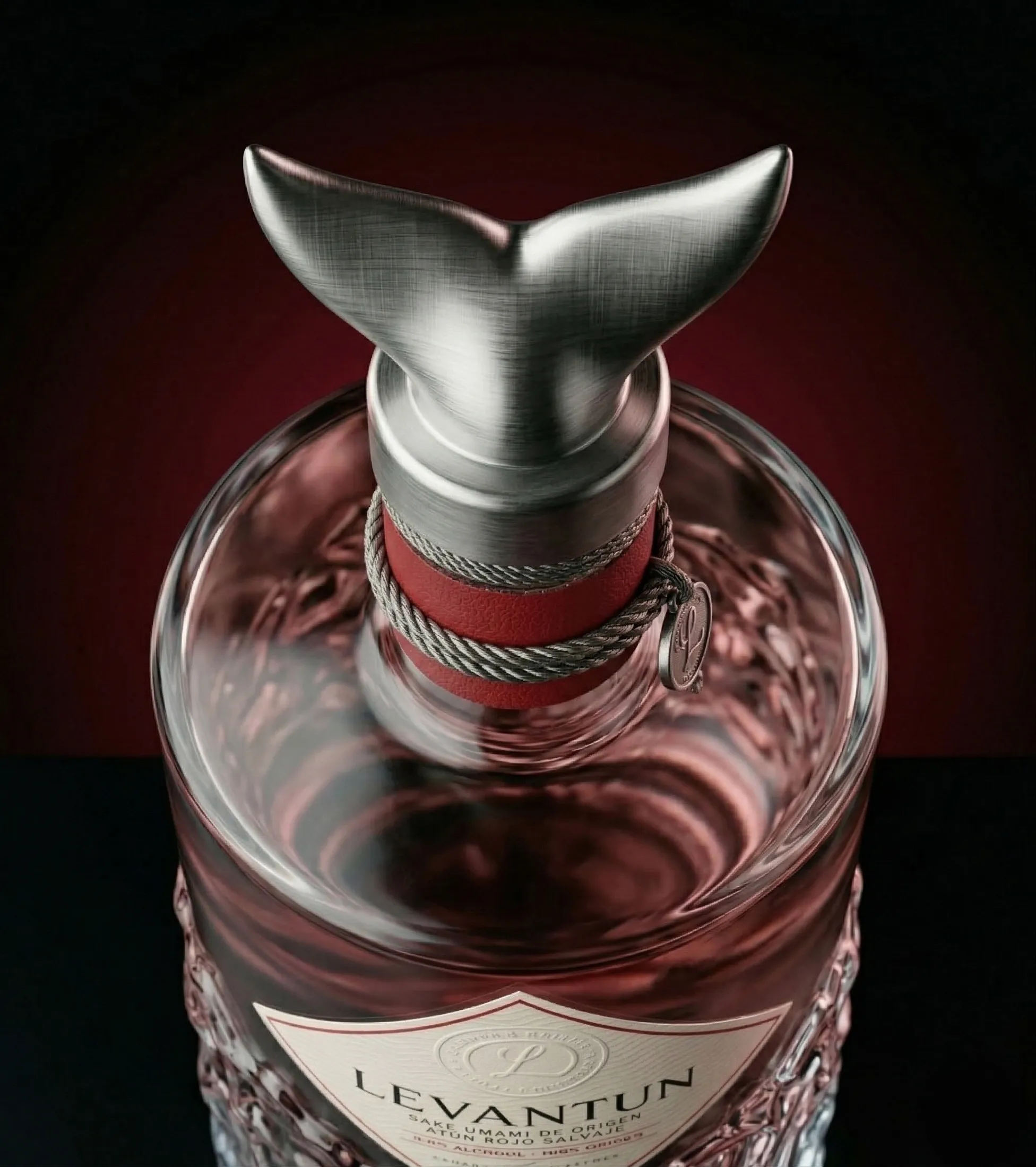
The closure — a steel cap shaped like a tuna tail — functions as a direct symbol of origin and as the sculptural finishing touch of the whole.
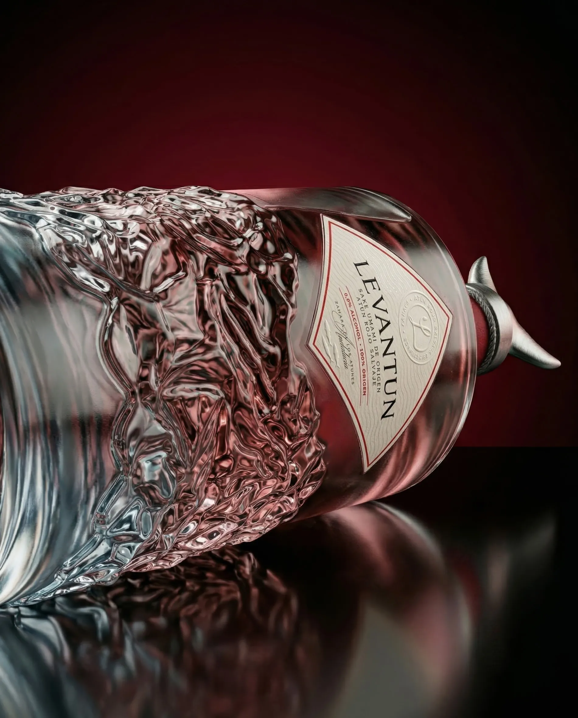
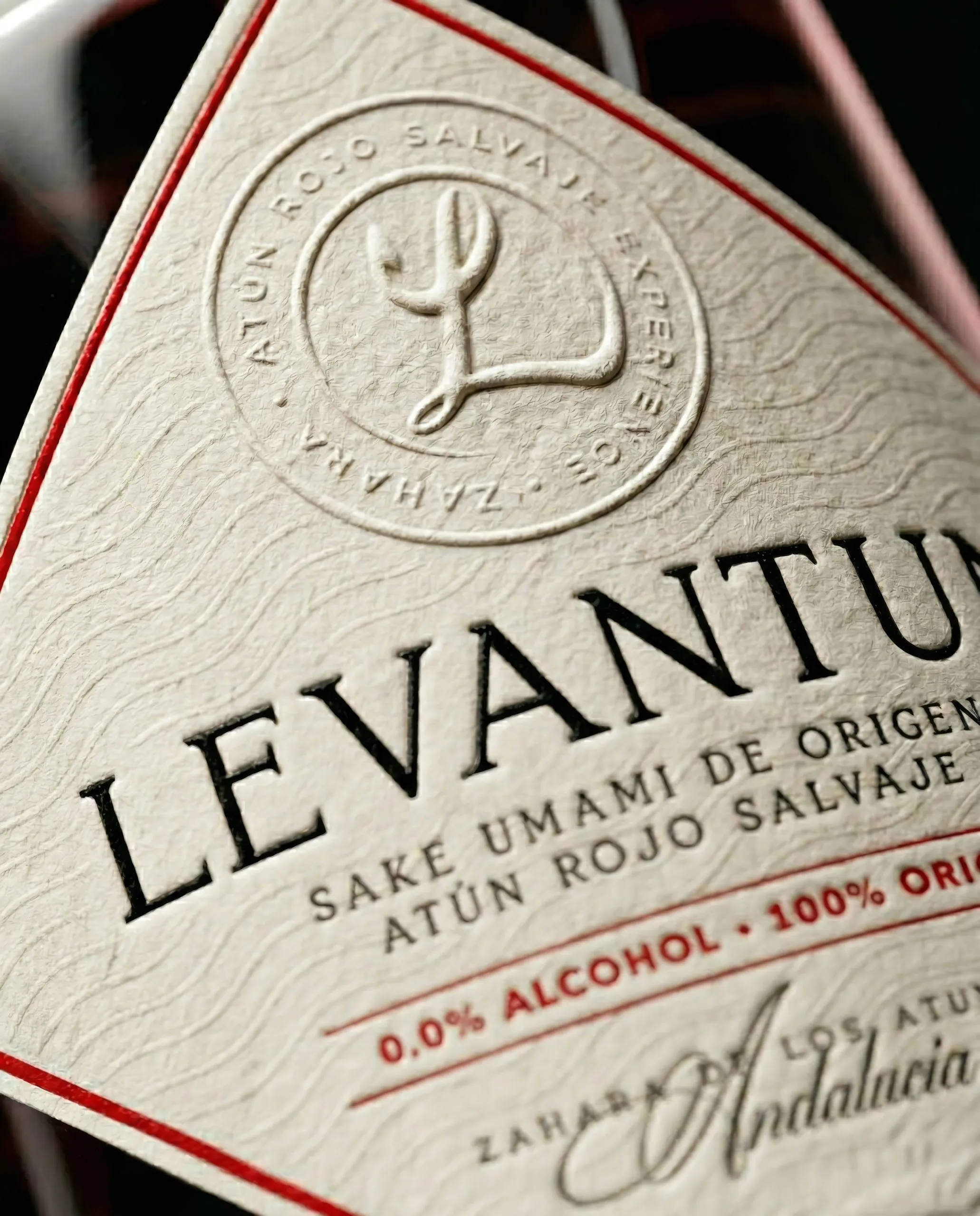
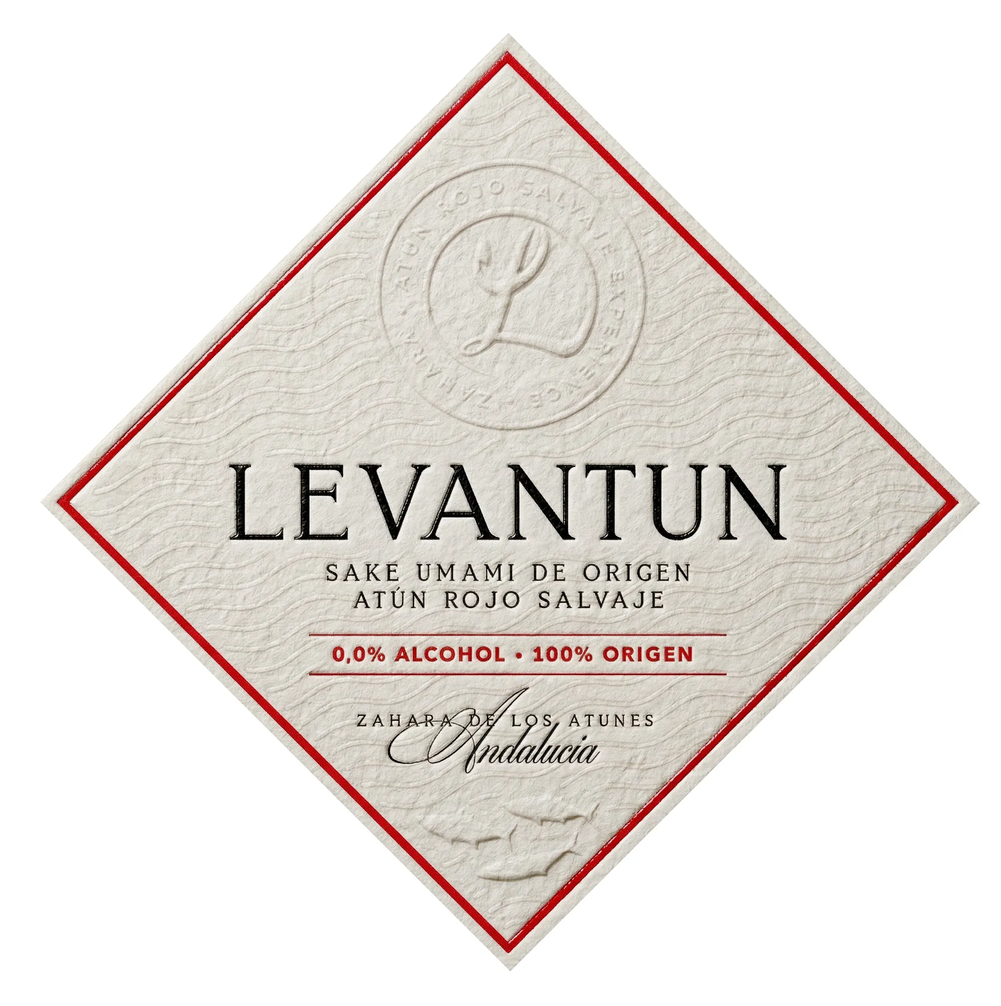
The label is developed on Fasson® Lin Fiber FSC®, a paper with visible fibers that brings texture, irregularity, and material presence. Far from decorative, it is conceived as a structural layer:
- precision blind emboss finishes emerging from the surface
- varnishes that build contrast and depth
- integration of real bluefin tuna DNA through Cromotika®, turning the ink into a biological signature
Each element — glass, paper, ink, dosing system — follows the same logic: precision, origin, and control.
LEVANTUN® is not just a beverage.
It is a material language applied to haute cuisine.